Imagine your day spent in a windowless workspace, you feel lethargic and uninspired as you escape outside for a breath of fresh air. A brisk walk and a couple of deep breaths bring a renewed vitality as you marvel at the wispy white clouds floating in the expanse of translucent blue sky. Framed by layers of green in distant mountain ranges, you find comfort in the golden beams of light that warm your cheek. The atmosphere is filled with colored light. The impressionist painters captured this play of color and light in their outdoor scenes. Focused on the fleeting moment, their sketchy technique and strong color palate conveyed the play of light in the open air.
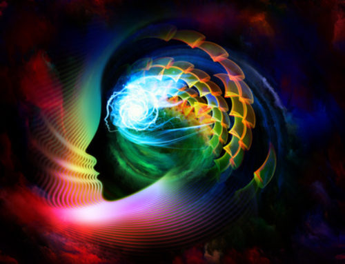
There is a rising awareness of the influence of color and architecture on ones well being. Affects associated with the use of bland, monotonous environments include sensory deprivation and are a deterrent to healing. The brain requires constant change and stimulation, such as nature offers us. One example of providing this in an interior environment is with Lazure painting, a technique revived from the renaissance artists and used in some healthcare settings today. The application of the paint allows transparent layers of color to be used, portraying the depth we may find in the sky, a stream, or a feather. Although this is one technique for the application of color, there are other practical applications for the healthcare environment. Particular attention should be given to populations who are confined in an environment, such as long term care or hospitals. The opportunity for changes in lighting, colors and artwork for the proper functioning of the central nervous system must be observed.
Color plays an important role in ones emotions as well as the physical responses of blood pressure, heart rate and endocrine responses. Much debate abounds as to the therapeutic use of color, spurred by such studies as Californias San Bernardino County Probation Department putting aggressive children in bubblegum pink cells. Experiencing overwhelming results, correctional facilities across America began to use passive pink in certain areas of their facilities. While the jury remains out on many studies, science reveals several assumed rules. Green, in the middle of the spectrum, sits on the retina of the eye, whereas red falls behind the retina and blue falls in front of it. This is why green is promoted as the most restful of colors, your eye doesnt have to work as hard to perceive it. Time spent in a green room is often underestimated, making it a good choice for waiting areas, and to soothe anxious patients. Green is also used to increase visual acuity in surgery, compensating for the after image problems of working with the complimentary color of red. Red is thought to stimulate the nervous system, increasing brain wave activity and accelerating the heart rate. Studies indicate red can aid the infant brain in developing more neural connections. Blue has been shown desirable for use in coronary care areas, perhaps from its potential ability to aid the brain in secreting tranquilizing chemicals. Blue also show promise as an aid in dieting based on the lack of blue food.
In summary, colors in the healthcare setting should not be arbitrary choices, based on short-lived trends, but choices rooted in practical application. The need for accurate color rendering to a dentist judging enamel colors, or a physician judging skin tone carry more weight than the latest Color Institute forecast. As well the ability for a patient to see themselves surrounded by a light tint of rose or peach that is flattering to skin tones can go far in developing a healthy morale. In our quest for clinical cleanliness, vanilla budgets and trendy color palates we must not forget the affects of color and the deeper implication of its use in our architecture.